Anna Porter Artist - Fine Art

Blog

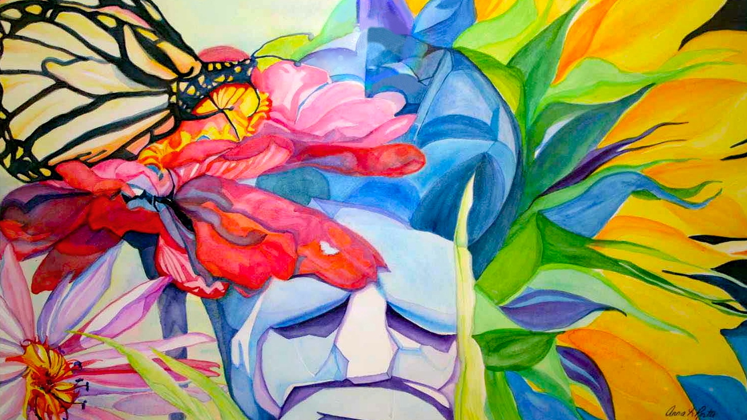
In Full Bloom by Anna Porter, Best in Show, 2015 Portland Rose Festival Art Show


In Full Bloom by Anna Porter, Best in Show, 2015 Portland Rose Festival Art Show

In Full Bloom, Best in Show, 2015 Portland Rose Festival Art Show, watercolor & Golden fluid acrylic on Arches 140 lb. hot press paper, 28 X 28 inches (framed), copyright ©2015 Anna Porter Artist (Website: https://www.annaporterartist.com, Instagram: @annaporterartist, Facebook: AnnaPorterArt, Pinterest: @annaporterart, Twitter: @annaporterart, Tumblr: annaporterartist, Fine Art America: annaporter).


So very thrilled that my painting, In Full Bloom, watercolor & Golden fluid acrylic on Arches 140 lb. hot press paper, 28 X 28 inches (framed) was accepted into the juried 2015 Portland Rose Festival Art Show, June 7th - July 10th, and won the Best in Show Award. I was extremely honored to accept this award on Sunday, June 7, 2015 at the Opening Reception for this venerable art show, that is held each year at Oregon Society of Artists (http://www.oregonsocietyofartists.com, Facebook: oregonsocietyofartists). Located at 2185 SW Park Place, Portland, Oregon 97205 (on the N.E. corner of St. Clair & Park Place), (503) 228-0706, the OSA Gallery is open to the public Monday to Saturday 1:00PM to 4:00PM (closed Sundays and holidays). This year the juror for the show was renowned sculptor and painter Geoffrey McCormack (http://www.mcsurf.com). The 2015 Portland Rose Festival Art Show is an officially sanctioned Rose Festival Event (Website: http://www.rosefestival.org , Instagram: @pdxrosefestival, Facebook: PortlandRoseFestival, Twitter: @PDXRoseFestival). 


This is a beautiful show, filled with award-winning paintings of Roses, Portland Scenes and Rose Festival Scenes, all part of the "Bloomin Good Time" theme. It is sure to delight everyone who enjoys fine art, flowers (especially roses), Portland and the many fun activities surrounding the annual Portland Rose Festival. The OSA Gallery is located just a couple of blocks below the entrance to Washington Park (Map It!), within walking distance to one of my favorite gardens in the city, the Portland International Rose Test Garden. I will be sitting the OSA Gallery in the afternoon on Wednesday, July 1, 2015 and I would love to see you there!


I love roses. They are my favorite flower. I love painting roses, photographing roses, and planting roses. I could not be happier to have my first Best in Show award be for my painting of this beautiful rose. To create this painting, I referenced an original photograph that I took of a beautiful pink rose, titled "Pink Rose Inside". As with most of my floral paintings, I am drawn to the abstract shapes and colors that I see in nature and in my photography. I drew the major lines in the flower lightly in pencil on Arches 140 lb. hot press paper, created an underpainting in washes of watercolor to capture the abstract shapes that caught my attention, and applied glazes of Golden fluid acrylic to intensify and bring out beautiful colors that appeal to me. I finished it with line details in both watercolor and Golden fluid acrylic. The painting is float mounted on an off-white matte and beautifully framed in a cherry-colored wood frame. Sincere thanks to Macadam Frame Central Portland (Website: http://framecentral.com, Facebook: Macadam Frame Central Portland) in John's Landing for the stunning job that they did custom framing this painting for me with a one day turnaround.


A limited edition print (giclee) of the original painting will be created at the end of the show, after July 10, 2015, and is available for purchase on my website HERE. 


Huge thanks to Oregon Society of Artists, the 2015 Portland Rose Festival Art Show, and juror Geoffrey McCormack, for this wonderful honor. 

Read More


Using iOS apps to create new works of art aka How I created Death of a Dahlia Abstracted


death of dahlia abstracted, digital painting in superphoto and aviary, copyright 2014 Anna Porter Artist

One of the really fun things about smartphones and tablets is the plethora of new digital photo editing and painting applications that are available to turn your digital photographs or photos of your paintings into new interesting works of digital art. Two of my favorite applications are SuperPhoto by Moonlighting.io and Aviary's Photo Editor. I use both apps on my Apple iPhone 5, and they are both available on Apple's new iPhone 6/6s as well. This blog post shows step by step how I took a great digital photograph of a dead dahlia blossom with my iPhone 5 camera and turned it into a finished piece of abstract art in literally a few minutes.


To create this piece, I first took a digital photograph of a dead dahlia blossom that I saw on my daily dog walk. I liked the textural nature of the dead petals and felt a pang of sorrow at its passing. Just a couple days before I had taken a digital photo of its sibling in full bloom in all of its shining glory.


Step 1 - Take a great digital photo.


Death of a Dahlia, original digital photograph by Anna Porter Artist.


In this case, I took the photo with my iPhone 5 because that is what I had with me at the time. Had I been on a walkabout with my Canon EOS Digital Rebel, I could just as easily have taken this image with my DSLR camera, although getting it to my iPhone 5 to use my iOS photo editing apps would then take a couple more steps. I would first have to transfer the image from my DSLR camera to my Apple iMac computer using Image Capture, iPhoto or Aperture, and then share it with my iPhone 5 using Apple's iCloud service, or save it to my Dropbox or something similar, so that my iPhone 5 could access the image.


While I really liked this digital photograph in and of itself, I decided that I would play with it a little in SuperPhoto to see what else I could create. When I got back to my studio, I opened the SuperPhoto app on my iPhone 5 and selected "New Additions" from the list of possible filters and effects. You can download the SuperPhoto app for free in the Apple iTunes Store. You can purchase an incredible number of special effects from within the SuperPhoto app, and Moonlighting.io comes out with new effects on a regular basis. Or you can use some of the basic effects that come with the free app. There is a very creative group of developers over at Moonlighting.io and the sky is the limit in terms of what you can do by layering different effects in SuperPhoto (and SuperPhoto is only one of the many applications offered by Moonlighting.io).


To create this piece, I opened the SuperPhoto app on my iPhone 5 and selected the SuperPhoto "Shattered" Effect. 


Step 2 - Open the SuperPhoto app, select the Shattered Effect and the photo that you want to use it with:


Step 3 - Depending on which Superphoto effect you choose, you will either be given the opportunity to "paint" a part of the original digital photograph that you want to edit using the pencil and eraser tool (Step 3), or SuperPhoto will begin working its magic on the whole image (Step 4). In this case, I was presented with the "Paint your selection" screen below. You can be as finely detailed as you need to be in order to select the part of the image that you want to "paint"  by varying the size of the pencil or the eraser (use the slider with the round white button at the bottom of the screen to change the size). Then simply use your finger to paint the part of the image that you want to use.  If you overstep your boundaries, you can use the eraser tool to remove the unwanted "painted" area. Press the checkmark in the upper right corner of the screen when you are finished.


Step 4 - Wait a few seconds while SuperPhoto spins its magic. A lovely butterfly flaps its wings letting you know that your photo is undergoing metamorphosis and is about to be transformed. 


It took about 1.5 seconds to process this edit on my 64 GB iPhone 5 running iOS 8.0.2. ( I had to snap that screenshot fast!)


Step 5 - SuperPhoto Shattered effect applied to my Death of a Dahlia Et voila!


Nice work, but I wanted to heighten the colors a bit. So I saved the newly created SuperPhoto image back to my camera roll on my iPhone 5. I could have applied another effect within SuperPhoto to do this, but instead I decided to use the Aviary Photo Editor app on my iPhone 5. In addition to pre-packaged effects, Aviary has an easy-to-use advanced image editor and text editor so you can sign your artwork in the app.


Step 6 - Save the new SuperPhoto creation to your device.


At this point I could have shared my new creation using the SuperPhoto Share option, or submitted it to SuperPhoto's User Creations gallery to be considered for a feature on Moonlighting.io.  But because I still wanted to work with the image a little more in the Aviary Photo Editor on my iPhone 5, I instead chose to save the new creation to my iPhone 5's camera roll by selecting Save.


Next I opened the Aviary app on my iPhone 5. The Aviary app immediately goes to your camera roll by default to let you upload a photo for editing. You can tell it to go to other albums by pressing the album button at the bottom of the screen, or you can take an original picture with the camera button at the bottom of the screen. I selected the SuperPhoto creation that I had just saved to my camera roll. When you download the Aviary app from the Apple iTunes App Store, it comes with a several original effects for customizing your photos, as well as simple and advanced editing tools. You can purchase additional effects, frames, stickers and bundles from within the app. I really liked what I did already with the SuperPhoto app, so I just used the simple Enhance options at the bottom of the Aviary Photo Editor screen.


Step 7 - Open Aviary app and select the SuperPhoto creation from the camera roll.


Step 8 - Select Enhance from the Photo Editor main menu at the bottom left of the next screen that appears.


Step 9 - Select the Enhance effect that you want to apply to your image:


(a) Hi-Def

(b) Scenery

(c) Food

(d) Portrait

(e) Night


From left: Step 9 - Enhance options (a) to (e) applied to my SuperPhoto creation.


For this image, I really liked Option 2 - Enhance Scenery, so I selected it and then pressed Apply at the top right of the Aviary screen. As I am writing this article, Option 5 - Enhance Night is also calling to me, and so I think I will return to the app and save that version at a later time as well. Had I chosen Effects, Frames or Stickers instead of Enhance, in Step 8 above, I could have applied any of the myriad of effects, frames or stickers that either came with the Aviary app, or that I purchased later from within the app. All of these effects can be applied at the press of a button and the Aviary Photo Editor provides an instantaneous preview of the edited artwork.


One of the things that I love about the Aviary Photo Editor is that it not only has great filters and effects that you can easily and quickly apply to your photos, it also has an advanced image editor and text editor built into the app, so you can do more complicated edits like:


▪️ adjust the brightness, contrast, warmth and saturation

▪️ improve the sharpness

▪️ change the orientation

▪️ crop the image to several standard sizes or a custom size

▪️ alter the focus of the image with a radial or linear tool

▪️ create a color splash by removing all color in the image and painting the color back in selected areas

▪️ whiten (bleach) selected areas

▪️ fix a blemish or remove red-eye in a portrait, or de-emphasize an area by blurring it, PLUS

▪️ you can sign your newly created artwork right in the app without having to export it elsewhere for text editing.


Step 10 - Select Text from the Aviary Photo Editor main menu.


Since I was happy with the heightened colors provided with the Enhance - Scenery effect, all that was left to do was sign my new masterpiece, so I scrolled the main menu at the bottom of the Aviary Photo Editor screen to the right by swiping my finger to the left, and selected Text.


Step 11 - Once in the Text Editor you simply use the options from left to right to:


(a) choose your text font

(b) choose your text color

(c) enter your text

(d) position your text by dragging it where you want it to appear; and

(e) size your text by sliding the white button with the double arrow on it.


From left: Step 11 - Aviary Text Editing Options (a) to (e) above.


Then simply press Apply at the top right on the screen to apply the text to your photo, then Save to save your finished work.


Step 12 - Apply text and save Photo.


Step 13 - Share your new artwork.


When you press Save, the Aviary app brings up the Share screen that allows you to share your artwork on social media (Instagram, Facebook, Twitter), email it to a friend, print it at Walgreens, send it in a Text Message, etc. If you want to save your new creation to the camera roll, simply press Done.


Step 14 - You did it (or in this case I did it)!


Death of a Dahlia Abstracted, digital painting created in Superphoto and Aviary from a photo of a dead orange dahlia blossom near my artist gardens, annasgardens. 


Fine art prints of Death of a Dahlia Abstracted  are available for purchase in my Fine Art America Gallery in various sizes, printed with archival inks on acid-free stretched canvas and fine art papers to create museum quality works of art that last a lifetime. Choose from prints on professionally stretched canvas, acrylic, metal, fine art papers (framed or unframed), greeting cards, and iPhone and Samsung Galaxy smartphone cases. Prices start at $22.56 for an 8 x 8 inch unframed fine art print on luster photo paper, not including shipping. Various sizes up to 36 X 36 inches are available for this image.


Please click on this link: http://fineartamerica.com/featured/death-of-a-dahlia-abstracted-anna-porter.html for a complete list of products and prices. You can also download the PDF Sales Sheet for Death of a Dahlia Abstracted. 


Read More


Anna Porter will be at Oregon Society of Artists this Sunday 09-22-2013 1-4P to discuss her painting, Textural Plantings, in the 2013 Fall Juried Show


Textural Plantings, watercolor and watercolor crayon, copyright 2013 annaporterartist

Anna Porter, Fine Artist and Digital Photographer, will be sitting the Gallery at Oregon Society of Artists this Sunday, September, 22, 2013 from 1:00PM to 4:00PM! Meet the artist to view and discuss her painting, textural plantings, watercolor and watercolor crayon, and get a personal tour of all the beautiful artwork on display in the 2013 Fall Juried Show! Mark your calendar! 

Note from the Artist:

I am so thrilled and excited that my watercolor and watercolor crayon painting, textural plantings, was accepted into the 2013 Fall Juried Show at Oregon Society of Artists, 2185 S.W. Park Place, Portland, OR 97205. Gallery hours are Tues. to Sun. 1:00PM to 4:00PM (closed Mondays and holidays). Show runs from 09-08-2013 to 10-03-2013. Hope to see you this Sunday afternoon 09-22-2013! I am looking forward to meeting you at the Gallery at Oregon Society of Artists, where I will be available to discuss my painting in more detail and answer any questions that you may have. I am also delighted to be able to give you a personal tour of all the beautiful artwork on display in this year's 2013 Fall Juried Show at OSA! Don't miss it! 

This original painting is available for purchase $500.00 USD. Contact [email protected] for more information.

A poster for the painting is available for purchase in my Instacanv.as Gallery here:

http://instacanv.as/annaporterartist/piece/538769493010568782_33853476

Anna Porter

Anna Porter Artist

Fine Art and Digital Photography

email: [email protected]

website: http://annaporterartist.com

prints: http://instacanv.as/annaporterartist

facebook: https://facebook.com/AnnaPorterArt

instagram: http://instagram.com/annaporterartist

pinterest: http://pinterest.com/AnnaPorterArt

twitter: http://twitter.com/AnnaPorterArt

art blog: http://annaporterartist.com/blog

photography blog: http://annaporterartist.tumblr.com

Read More


Painting Winter's Light


Winter’s Light, acryla gouache on canvas

Lessons Learned Painting the Colors of Winter

in a workshop by Nancy Smith Klos at Klos Studios

By Anna Porter Artist

When Nancy Smith Klos at Klos Studios posted a flyer at Oregon Society of Artists earlier this year announcing a new workshop that focused on painting the colors of winter, I jumped at the opportunity. Long a fan of Claude Monet’s beautiful and subtle winter scenes, I was thrilled to learn that one of the paintings that we would be studying in the workshop in order to analyze the colors of winter was his famous La Pie (The Magpie).

I am the kind of artist that likes to jump in and start painting, so Nancy’s approach to having us first do a color wheel and mix together all of the complementary colors was, well, I have to admit, a little annoying at the time. But I am glad that I did it! Nancy knew something important about the colors of winter — that mixing complementary colors produces a vast array of beautiful neutrals that are very helpful when painting winter scenes.


To create our palettes, Nancy introduced us to a new medium for me, acryla gouache. That’s right! An acrylic and gouache polymer emulsion made by Holbein. In art school I had learned that acrylic and gouache don’t mix particularly well, but apparently Holbein did not get that lesson. This medium mixes well, has less of the margarine-y feel of acrylic that I hate, and DRIES FAST, so you have to WORK FAST! I usually paint slow as a snail so I knew this definitely was going to be a challenge! Nancy had us work from a 12 color Holbein set of acryla gouache. We began by mixing our primary red, primary yellow and primary blue (the set has a warm and cool red in it which we used to mix a primary red and so on). From there we mixed our secondary colors and one color in between each, which we arranged on a standard color wheel. Then the fun began! We mixed the opposite colors on the color wheel in varying degrees to come up with a beautiful array of neutrals.


I loved the next exercise! We looked at photos of winter scenes painted by Claude Monet, Childe Hassam, and Albert Bierstadt (among others) and selected one for a quick study. I selected Snow Impressionism (Fig. 1 below), a photo of a section of La Pie (The Magpie) by Claude Monet that Nancy provided. I referenced it and the color wheel that I had created the day before to create my palette.


To mix a winter palette that closely represented the colors that I saw in the reference photo, I created a dark by blending my primary red with my secondary green (both mixed from the colors in the Holbein set). To this color, I added white to create lighter versions of this dark, and Payne’s Grey to create my darkest dark. I used this same process, adding Titanium White or Jet Black (provided in the set) or Payne’s Grey (provided by Nancy) to each of the primary colors and complementary color mixes that I had learned how to create in the previous workshop session, to come up with a palette that closely matched the colors that I saw in the reference photo (See my palette in Fig. 3 above). I painted a daub of each color on note paper and made some cryptic notes beside each stating how I had arrived at it. (Note to self - be a little less cryptic and a little more organized next time!) 

That done, I did a quick painted sketch of a section of La Pie (The Magpie) from the reference photo (Fig. 1 above). And I mean quick - that paint was drying fast! I was pleased with the outcome (See Fig. 2 above), even though it was a little too pinkish in the snow (but then I do tend to see the world through rose colored glasses) and my Magpie obviously had been dining a little too well compared to Monet’s graceful bird! While I had not replicated the photo or Monet’s beautiful painting exactly, I had learned how to mix most of the colors. I was excited and looking forward to the next session of the workshop.

For the home stretch, Nancy had us bring in a photo of our own choosing for our final painting. I selected a lovely photo of my artist gardens from my Winter 2008 photography book that I had created for my family and published myself using Apple iPhoto and publishing services.

“In December, 2008 we had an unusual and plentiful snowfall in the Portland, OR area that lasted for two weeks instead of the usual two days, and I thought that this would be a great subject for my painting.”

 Anna Porter Artist

I sketched in the major elements by gridding the photo (Upper Left and Right in Fig. 4 below), then set about mixing my colors. I used some of the colors that I had learned from the Monet study in the workshop and created some new colors on the fly. I was only about half-finished my painting by the end of the workshop (Lower Right in Fig. 4 below), but felt confident that I had learned the necessary skills to finish it in my home studio.

I thoroughly enjoyed this workshop by Nancy Smith Klos and highly recommend that you check out her upcoming workshops at Klos Studios and watch for her announcements in the Brushmarks newsletter published by Oregon Society of Artists. Nancy excels at breaking down a complex process into easily understood bite-size morsels and provides great feedback and individual attention along the way. She recently opened a new studio in Southeast Portland and will be having an open house there on August 22, 2013 5-8PM.

I will be sitting the gallery at Oregon Society of Artists on August 15, 2013 from1-4PM and I would love to give you a personal tour of all of the paintings on display in the Student-Teacher show, and talk to you more in person about my painting. The gallery is located at 2185 S.W. Park Place, Portland, OR 97205 and viewing hours are Tuesday to Sunday 1-4PM, except holidays. Call (503) 228-0706 for information.

You can download a copy of this blog post in PDF format here.

Anna Porter Artist

Fine Art & Digital Photography

Visit my Website!

Sign up for my Blog!

Like Anna Porter Art on Facebook!

Follow my Pins on Pinterest!

Get my Tweets!

Follow Anna Porter Artist on LinkedIn!

Contact me!

Read More


Painting from the Subconscious - Faces in my Vegetable (work in process)


Faces in my Vegetable, 2013, acryllic (work in process)

Faces in my Vegetable, 2013, digital collage

I started a new painting class this past Saturday - a Christmas gift from my daughter who noticed that since I stopped taking art classes four years ago (due to time constraints from working two jobs and budget constraints from the recession), my painting production had slowed to a snail’s pace, even though I had created a small studio at home expressly for that purpose. I was very grateful for the class, but also intimidated. I had not taken a college-level painting class in such a long time and it was in a medium that I do not usually use - oil or acrylic. I am a watercolor artist and digital photographer. Occasionally I throw in a little golden fluid acrylic, pastel or collage in my paintings for variety, but I paint like a watercolor artist. And the process for painting in watercolor is different from the standard painting process.


But I found that I adapted very well - at least in the class. The first assignment was to paint a monochrome tone study of an object in black and white, something I never do as a watercolor artist, because I avoid both black and white like the plague when painting in watercolor. When I do rarely use black, I find it is better to mix it from the colors on my palette instead of using black out of the tube - that way the resulting black has much more depth and is more interesting, and for white I leave the white of the paper. I also love color, so I rarely do monochrome tone studies unless it is for an assignment or a special request.


My Vegetable, digital photograph (set up for painting)

Little did I know that the subject for my painting, an innocuous looking squash-shaped thing with skin that looked like a potato, would turn out to be a possessed vegetable and prove to be one of the most difficult things that I have ever tried to paint. I set up my vegetable on a desk to the right of my easel. I placed it at about a 30 degree angle pointing away from me to the left, so that it was foreshortened somewhat, and the large bottom looked even larger than it was. Because I almost never finish a painting in one sitting - a production artist I will never be - I took some photos of my vegetable, so I could finish the painting in my home studio. And that is where the fun (NOT) began …


When I tried to finish the painting from the photo instead of the actual vegetable, I just could not do it. Every stroke looked wrong. My original drawing seemed way off. I tried again and again and finally, frustrated and furious, I broke down and had a full fledged temper tantrum on it. I painted it out to start over again from scratch, something I rarely do. Usually I will keep working through a difficulty in a painting. Or stop and look at it another day, when I either see what the problem is, or I find something to like about it in its present form. Sometimes in watercolor I will wash off a painting or an area of a painting, when I overdo it; but then a faint underpainting remains as a guide. Acrylic, however, does not wash off once it has dried, and my wounded ego wanted to obliterate the source of my frustration. So obliterate it I did.


Discouraged and heartbroken, but refusing to end the day defeated, I took some pastels and tried laying in a drawing for Vegetable #2, this time having to paint it solely from the photograph of my vegetable. Had I been thinking more clearly I would have realized that painted board does not have the tooth to hold pastel, but I was not thinking terribly clearly at the time and I was determined. I drew and drew, but I could not get the drawing in perspective. Finally, exhausted from six hours in painting class and another six-eight hours of painting and re-drawing at home, I gave up, used fixative to set my drawing in the stage that it was at, and decided to sleep on it.


Faces in my Vegetable, pastel on painted clayboard (drawing for painting)

The next morning I got up and looked at my drawing, and there, plain as day, were two faces in my vegetable, one looking straight out at me and one looking backwards. I had not been aware of any faces the night before when I put down the pastels and went to bed. Even though I could now see what I needed to do to correct the drawing (it is amazing what a little sleep will do for that!), I decided to go ahead and paint what I had. I figure those faces must need to be seen. I have no clue why. But seen they will be. And so I began painting anew to see where this two-headed potato-squash thing would lead me.

For the new painting, I decided to paint only what I saw in my drawing and not to refer back to my original photograph. To me the painting was now about the faces that I saw there, and not about the vegetable vessel. Since I  had used up all of my Titanium White and Ivory Black in my previous attempt, this time I used Golden Fluid Acrylic Paynes Grey and Zinc White, Pearlescent White Pearl Liquid Acrylic and Golden Fluid Acrylic GAC 700 medium. I painted the darkest darks first, applying the paint directly on top of the pastel drawing on the painted clayboard. For the darkest areas I used Paynes Grey only mixed with a little GAC 700 medium. I mixed pure Zinc White with a little White Pearl to paint in the lightest lights. Next I created a tone range from Dark Grey to Mid-Grey to White by mixing the Paynes Grey with varying amounts of Zinc White and White Pearl. I used these mixes to paint in the rest of the painting, adding more or less GAC 700 medium, depending on the transparency that I wanted to achieve. Because the vegetable was cylindrical, I tried to make my brushstrokes follow the outward curve of the cylinder to give it more dimension.

Faces in my Vegetable, 2013, acrylic (work in process)

My final steps will be to add another semi-transparent layer for smoother blending in some areas of the painting, and perhaps to add one or more transparent layers of mottled skin to my vegetable, now that the faces in it are firmly entrenched. On the other hand, I may decide to follow the course that I stated at the outset of this second painting and make it solely about the faces that I saw in my vegetable, without concerning myself with the outer appearance of the vessel. For that reason, this artwork is still a work in process. When it is complete, it will become available for purchase on my website at http://annaporterartist.com. Check back on my website to see the final painting.


Read More